Saturday 29 September 2012


127 hours is a factual-survival drama film based on a man who is a canyoneer (traveller who climbs waterfall jumping, abseiling etc..) He is very self-confident and enjoys taking risks; he goes deprived of informing anyone, no one is aware. Once he’s in Kenya land USA he does wild things and we are on this roller-coaster journey with him. However, things go bad he gets his hand trapped underneath a big rock so we stay with him on this and see if/in what way he survives.

The trailer starts off with the man himself saying "good morning everyone" the lighting used when he says this is; low key lighting as there are shadows in the background. Moreover using this it reinforces the setting he is in which looks like a cave, it looks effective. Then there are two establishing shots of the place he is going to, Kenya Land and it's both presented differently by, the first one being a key light. As it is the brightest and is the most influential it's perhaps shown this way as we want to get idea of what kind of place he is going to, and we clearly get the sense that it is indeed very beautiful. The second scene is done by having it as filter lighting, as there are shadows this is very effective as it shows the sun rising.

Throughout the film the majority of the time filter lighting is used; purely because they want to create an intense moment in the scenes, and it makes everything look and seem purely realistic. Moreover it lets the audience feel and understand what the character is going through. As he faces a load of emotions, using the different lighting depicts it by the way he is being characterized. High key lighting is used too as the effect appears more realistic and represents either a sunny or a more dimly lit scene. 

Prometheus is a science-fiction based on a group of people who return to the alien universe to meet extra-terrestrial creators of life however this may cause the extinction of human race on earth. So the audience watch nervously as they want to find out what they see and what may the outcome be to human beings, Prometheus was released in this year 2012.

 The poster uses under lighting which comes from below the subject leading to a distorted effect, this is used here as it dictates it is a science-fiction film. Moreover there is something that looks like a head which the audience is unaware of and this is presented by using top lighting, as it comes from above and can be used to accentuate the features of the head which looks like the main thing the film is featured about as it is the main feature of the film poster. Moreover their is a significant amount of low key lighting as it is created by using more filter lights. Furthermore the effect appears more realistic to the audience and might depict a more dimly lit scene. The major difference is although shadows are still created, the contrast between (chiaro) and (oscuro)  is much less pronounced. 

By having a black and white, and misty effect also the character being blocked this connotes enigma, as the audience is not immediately answered of who the character might be and thus draws the audience closer. Having the light through the darkness is very effective, as the audience has an idea that a 'woman' is discovering something which of course is non-existence. So the effect of lighting is used very effectively, as it draws the audience nearer and we want to know further what the film is about. The top lighting of the 'head' is done very effectively and this connotes that it’s the main aspect as the whole poster is focused on it, It's advantageous as it draws the audience nearer.

Thursday 20 September 2012

Advert Analysis

This is a poster of Taylor Swift advertising her latest perfume; Wonderstruck - beginning of something magical.

The first visual aspect you will notice looking at this picture is certainly the singer, Taylor Swift. This poster, is thus celebrity endorsement. By the singer  promoting her perfume and being in the advert, she clearly wants a lot of people buying this perfume of hers. It's not to colourful nor to dull, the colours in this poster seem to connote the personality, the type of songs she perhaps sings. and maybe the scent of the perfume itself.  As it has peaceful, calm colours. She's in an  inhabitant place there is no sign of urban life so it shows how its a calm and peaceful place, and the  light dusty pink (colour of her dress)  reflects how tranquil the area really is. Being in the forest, for an advertisement, is unique. And not many people would choose this location, so this is eye-catching for the audiences. Also,  it connotes that she is not doing nothing over the top, but just simply wants to deliver her message to us.


The facial expression which Taylor represents is neither serious, not overly happy. But has enigma, and it's  eye-catching towards the audience, as she is looking at us interacting and reaching out to the audience.This clearly connotes that she wants us to get the perfume as she is having that eye contact with the audience. Therefore, makes more people want to get it. This poster is a wide shot, as you can clearly see everything. The perfume, the name and the slogan. Moreover, we have a full shot of the singer herself,  which is beneficial for the audience, as they can see how she presents her perfume. Taylor Swift, promotes perfume. She informs us of the image, and slogan also the way she is represented and indulges the audiences into buying it.

The advert doesn't have a lot of text on it. However, it does compose quite a lot by only having a few things. She obviously thought about this, because the slogan being "the beginning of something magical" and having the big dress on clearly connotes the magic she is portraying. As if she were going somewhere magical, or in that location. This is a big impact on the audience as, if they buy it they would perhaps feel magical. As the scent, also the slogan being there would relate to it. So this could be her suggesting this to us, and make us feel the way she is feeling right now 'magical.' Having this she therefore brings her message out to the audience, and persuades them into feeling magical. And in order for them to feel that way, they should buy the perfume.

There has been editing on this advert, and it is beneficial. Because they have blurred the background of the trees, not the singer. This is good because it connotes that we should only be paying attention to her and the perfume. And it is clear so she therefore wants us to have the information known to us. The key light is soft and clearly shows everything, this is good as it wants us to see everything, and clearly portrays what it wants us to see. The typography, reflects on the colour and the whole frame itself. It connotes again, calmness. And reflects perhaps the songs she sings, and relates to the background too. It also matches the top colour for the perfume, so it's indeed eye-catching. Moreover, as it is in gold, the audience can clearly see it. The majority being her fan would have a connection towards the singer, as the name 'Wonderstruck' is from her song 'enchanted' which will attract more of her fans. And the people who are not familiar with her, would probably figure out her character, as its portrayed on the image. And therefore would want to buy it. The target-audience which this advert would attract is indeed, young   females. As they would already know her, or would like to after looking at this advert to try the perfume out.


Saturday 15 September 2012

The Possession Analysis

                            The Possession Movie Poster

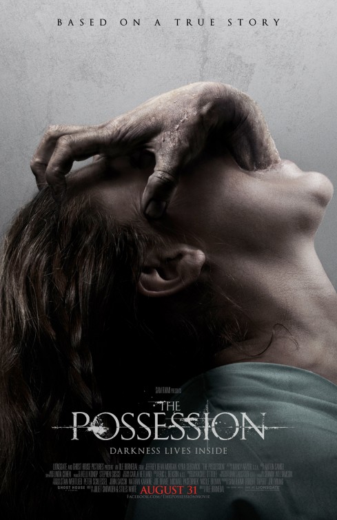
The Possession is a horror film based on a true story. This poster represents the young girl who had been "possessed" by a spirit creature. The whole film is based on her, and the things she does which is affected by the 'thing' inside her. Her family knowing about it; one by one, go on this life threatening journey with her. And try there best to help her to get better, but there's a twist to it. This film was released in 2012.

The connotation of the title informs an implication of the whole film and how it is based. Because the definition of possession literally means owning or controlling something. And the title being "The Possession" simply let's us now straight away, that someone is being owned by something else. Moreover the audience visually reading the text of this poster, gives it to them straight away. This is because the typography simply connotes that it is a horror film, as it's not in normal font so it has purposely been put that way. Their being a faded line crossed in the background of the text, and the letters been given more meaning to them. Just by adding the little sparks here and there; Has a big impact, because readers would clearly want to know what they are watching. And the title will say it all. 

The first visual aspect that the audience would capture is the hand coming out of the young girls face. As obviously it is very strange. The hand and the young girl being their, both compose that indeed something is inside her. And it's not something normal, but must be an old living body inside her. I can say this clearly because the hand connotes that it is old. Furthermore the hand clearly contrasts with the girls face. It is much more darker, and we see it very negatively. As it is old and the nails are dirty, were as the girls face is decent. The facial expressions of the girl and her body language clearly shows that she is frightened as she has her head down, and mouth wide open. And there's not much bright colours, but all in fact dull colours. This connotes mystery and horror. Also the audience therefore are determined to know what is going to happen with the young girl. She would be the main character as it only shows a image of her, so the audience also is keen to know who are part of her family. What is more if they are ready to help her.

Moreover the tagline being "darkness lives inside" connotes that something bad is happening to the young girl. And that it's living inside her, in addition the way they describe it grabs the readers attention instantly. And gets them thinking on how it's affecting the girl itself. The camera angle for this shot is a close shot, so we have a closer view of the girl and the hand. All we can see is how scared the girl really is, by her sweating and this is shown by how her hair is presented. Also, the hand has the authority and the power over the young girl. Even though it isn't human, and we cant even see the whole body of the creature. But only the hand coming out of the young girl clearly connotes the power. Perhaps, leading the girl on and directing in her what to do. It connotes varies of things in the audiences mind. Which is good because it makes us want to watch it and creates suspense, and horror.


The whole poster recapitulates the same idea. But just the difference is they do it in different ways but have the clear message to the audience. Another thing that would interest the audience is the typography right at the top. It says 'based on a true story.' As well as the way it is presented, it's not in the same font as "The Possession." But has been clearly given to us in a simple way. So we don't get confused, that it's part of the film. This would get the audience thinking, because the film being a true story may scare them more in knowing it could have happened. Or could happen. So that would want to get them indulged into watching, what was true about it or how it happened. Typically audiences would want to know the denouement overall. If it was good or bad, and they will only get it if they watch this film. So creating suspension and not giving it all away in the poster is a great advantage, because it gets the audience thinking more about it. And may indeed want to watch it.


Friday 14 September 2012

Media Consumption

Newspapers

  • If I am using a train or a bus, I will pick up The Sun newspaper. Or otherwise if at home, I will read the local newspaper that comes through the post every week.
  • Well on the first page of The Sun it would have the celebrity gossips, and the page number we can turn to. So I look at the subheadings in which I'm most drawn to and choose that page.
  • The sections that I never read are the ones that don't interest me. Like celebrities I'm not interested in, politics, or news that don't genuinely interest me.
  • The stories I read are shocking ones. That don't happen in every day life. Because, I'm not familiar with these kind of things. And they interest me, and I want to keep on reading it as to why they did something. Or what happened in the end.
  • I don't usually buy newspapers, neither my family. But me and family do if we are travelling a long way.

Magazines

  • I don't usually buy magazines, because I see the gossips and latest fashion online. But if I am shopping and I see magazines I buy them. The ones that I read are; Heat magazine, OK magazine and LOOK magazines.
  • The sections that I read are about, the celebrities and what they are up to. News about fashion, Pictures on celebrities. Or just the clothes that are in now. The ones I'm not keen into reading are sports, or people that I'm not familiar with. And I don't think horoscopes are true.. So I don't read that either.

Television

  • I spend 40 odd hours or so a week watching TV. But it really depends on if I'm out, or have a lot of work to do then its under.
  • In the weekday I watch it 3-5pm. And in the weekend 11-1 or 7-9.
  • The programmes I like best are Eastenders and Midwife-Nurse. Eastenders is interesting because it always has a new twist and keeps me entertained daily. And I like Midwife-Nurse, because I love babies. And it interests me to see how the Midwives help the newly mothers. And how the babies live the first stages of there lives.
  • I usually watch EastEnders and other programmes with mostly my sister. If my mum and dad are free then they watch it with us too. But I watch Midwife-Nurse myself, as the others don't like it as much as I do.
  • We all decide together as a family, because we like watching family films. Or comedy soaps together. So no one decides really, as we have the same taste in most things.

Radio

  • The stations I like the most are; Kiss 100, Capital Fm & Westside Radio. Because they all have the latest music, latest gossip and have latest news about London. 
  • I would say I spend about 55hours listening to the radio.
  • Before I go school 6-8am, when I come back 3-5 and at night, 8-11. 
  • BBC radio ones, because all I hear is the hosts talking about the news. It bores me, also the opera stations, Rock stations. And the ones that are in different languages!
  • If its before and after school me and my sister both put it on loud and listen to it. But if its during the weekend and were all doing work our whole family listens to Capital fm. 
  • I listen to the radio in my room, downstairs in the kitchen, or outside in the garden.
  • While I'm listening to the radio I am usually; getting reading, cleaning, doing work, or in fact dancing to the songs I most enjoy!

Cinema

  • In the last month I have seen The Possession with my best friend, and an Indian film with family friends.
  • I've seen Precious, The Pact, The Hunger Games and Final Destination 3. Through the TV and watching it on-line, on required websites.
  • My Friends and Family watch the films with me.
  • We all decide together depending on the releases or moods that were in.

Internet

  • I access the internet nearly every single day.
  • I access the internet at home, on my laptop or phone and at sixth-form to do my work.
  • It depends, whether it may be doing my homework or watching a film. But other than that Facebook, twitter, emails, you tube.
  • To receive information, communicate with my friends and families. And for entertainment purposes.
  • I listen to music, and go on social networking sites.

Year 12 Media Blog


I chose AS Media studies as I find the concept of Media very interesting because I'm a very creative person and this is the right subject for me, as it involves analysing, filming and creating magazines, leaflets, posters. I did Media in year 9 for GCSE's and we done various of things within the Media society, but we didn't get the advantage to do filming ect.. I would love to continue Media as I could be able to do filming and things I didn't get to do at a young age. 

I believe that Media is a part of an every day life, its based around general knowledge about life and I believe that the more I know about the Media, the more knowledge I have about the society and the world around us. Media has such a big impact on life, without it we wouldn't know what's happening around us, it would be a struggle for us to know what's happening in the local area, or other countries. 


I want to achieve a grade B or above for all my coursework and exams, this includes all the practical work. I am going to work very hard and try my best to stay focused at all times. At home I will be doing extra work and revision in order for me to achieve theses grades, that is my number one priority as I may go to university and continue Media studies if I achieve good grades.